2/26/2016
Continuing with Part 2 of our Manufacturing 101 blog series (See Part 1), we’re moving forward from the first few weeks of managing tedious lists to the next task of effectively collecting and reporting data. In order to appropriately display data, it is crucial to convey the true message and focus.
Selecting the Right Graphic
When highlighting a focus area, pictures always work best. If you were trained as an engineer, fighting the urge to project arguments as data may be difficult. You want to choose a graphic that will appeal to any audience and is easily understood. However, a big challenge is in selecting the right graphic. The best place to start is to use a Pareto.
History of the Pareto Chart
The Pareto (bar) chart is named after Vilfredo Pareto, an Italian engineer, sociologist, and economist who made important contributions to economics and the study of income distribution. He also helped develop the field of microeconomics and during his career, he determined that 80% of the wealth was controlled by 20% of the population. This observation was coined the “Pareto Principle” (80/20 rule). The 80/20 rule was seen as true by Pareto for any society, in any age or country. It turns out the 80/20 principle also works for reviewing things which affect manufacturing performance. However, it can also be misused more easily than any other tool.
Applying Pareto
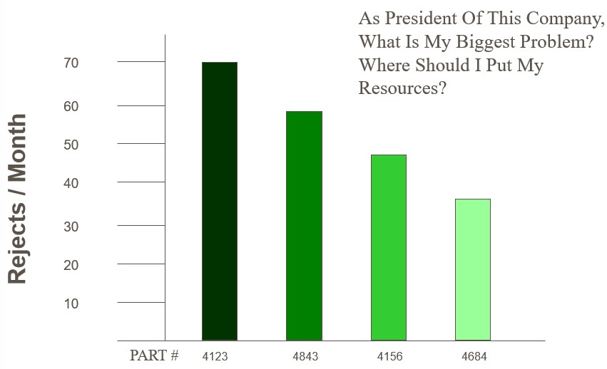
It is keenly important to understand that the Pareto is a “point in time” measure. What time frame you are using and the particular measure being used is very important.
Example 1: In the first instance, it is observed that part failures out of 4 different parts shows that one part stands out as most significant. Please note the data below is a monthly chart based on total rejects.
Example 2: Let's look at the same sample, with a slight difference in data.
The focus would now change to part number 4684. But, that’s the story for only one month, so…take a look at the chart for annual data.
You can see how each bar chart tells a story, allowing you to explain what is happening at any point in time. Now back to the 80/20 rule. This example aside, we typically find that we are directed toward the top 2-3 items to eliminate 80% of our problems. The graphic is the key to the communication.
Create Your Own Pareto
The following link provides step by step instructions to create your own Pareto:
http://www.excel-easy.com/examples/pareto-chart.html
Since 1991, MMTC has assisted Michigan’s small and medium-sized businesses successfully compete and grow. Through personalized services fitted to meet the needs of clients, we develop more effective business leaders, drive product and process innovation, promote company-wide operational excellence and foster creative strategies for business growth and greater profitability. Find us at www.mmtc.org.
Categories: Quality Management